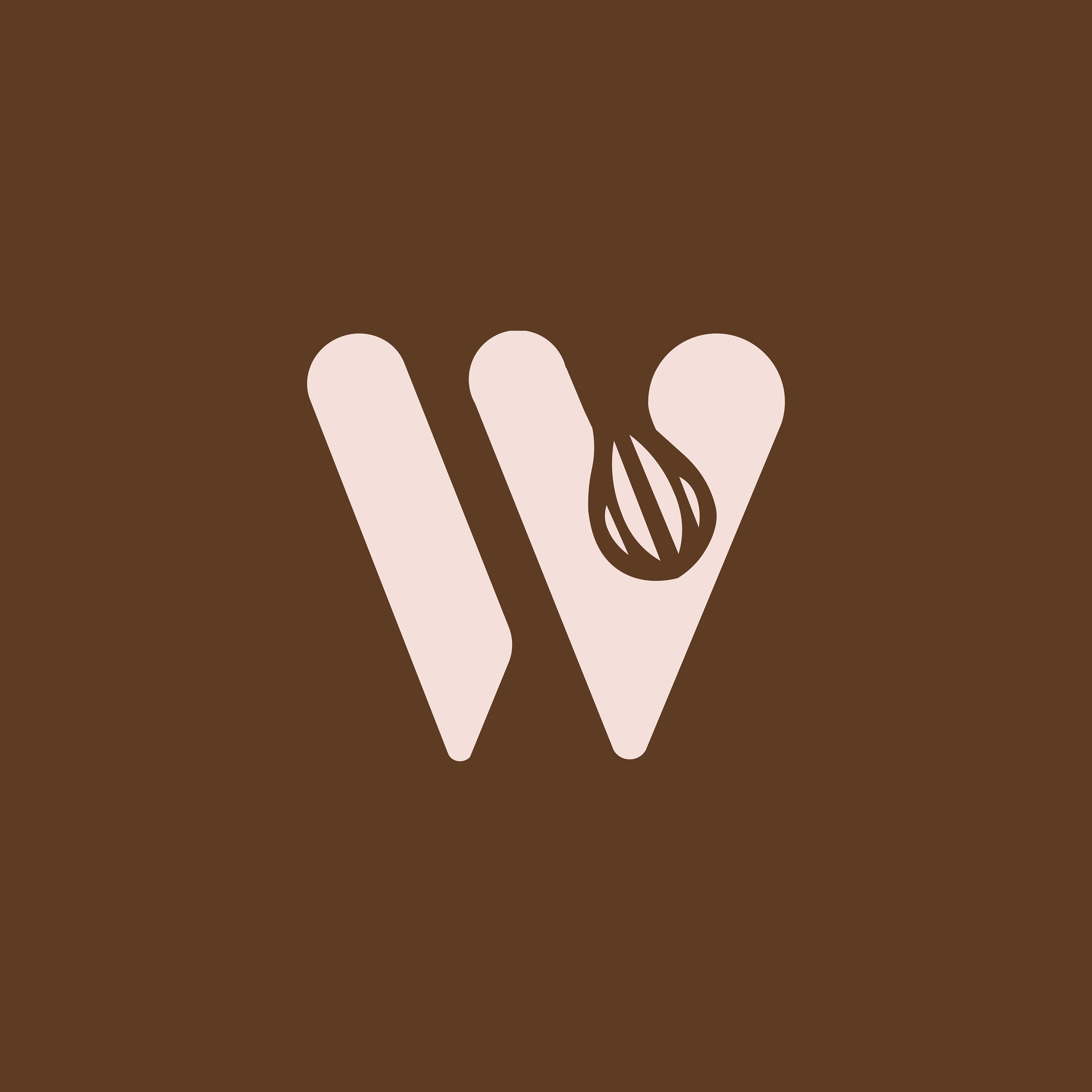
Logo Design – Twin Home Bakers
This logo was created for Twin Home Bakers, a homegrown baking brand lovingly run by twin sisters. The design centers around a bold, stylized “W”, crafted to subtly honor the word “twins” while representing warmth, unity, and balance all values that reflect both the brand and the bond between the two founders.
What makes this monogram unique is the delicate swirl motif nestled within the right stroke evoking imagery of a flame, whipped frosting, or a swirl of rising dough. It’s a small touch that instantly connects the logo to the baking world while adding a sense of movement and warmth.
The color palette pairs a creamy blush pink with deep chocolate brown, echoing the tones of fresh pastries, warm kitchens, and handmade sweetness. It captures the feeling of homely comfort while still being stylish and professional enough for packaging, branding, and digital use.
With its friendly shape and thoughtful symbolism, this logo is more than just an identity it tells the story of two passionate sisters turning their love for baking into a brand. Ideal for stickers, boxes, labels, or even oven mitts, it’s designed to feel personal, memorable, and entirely made with heart.
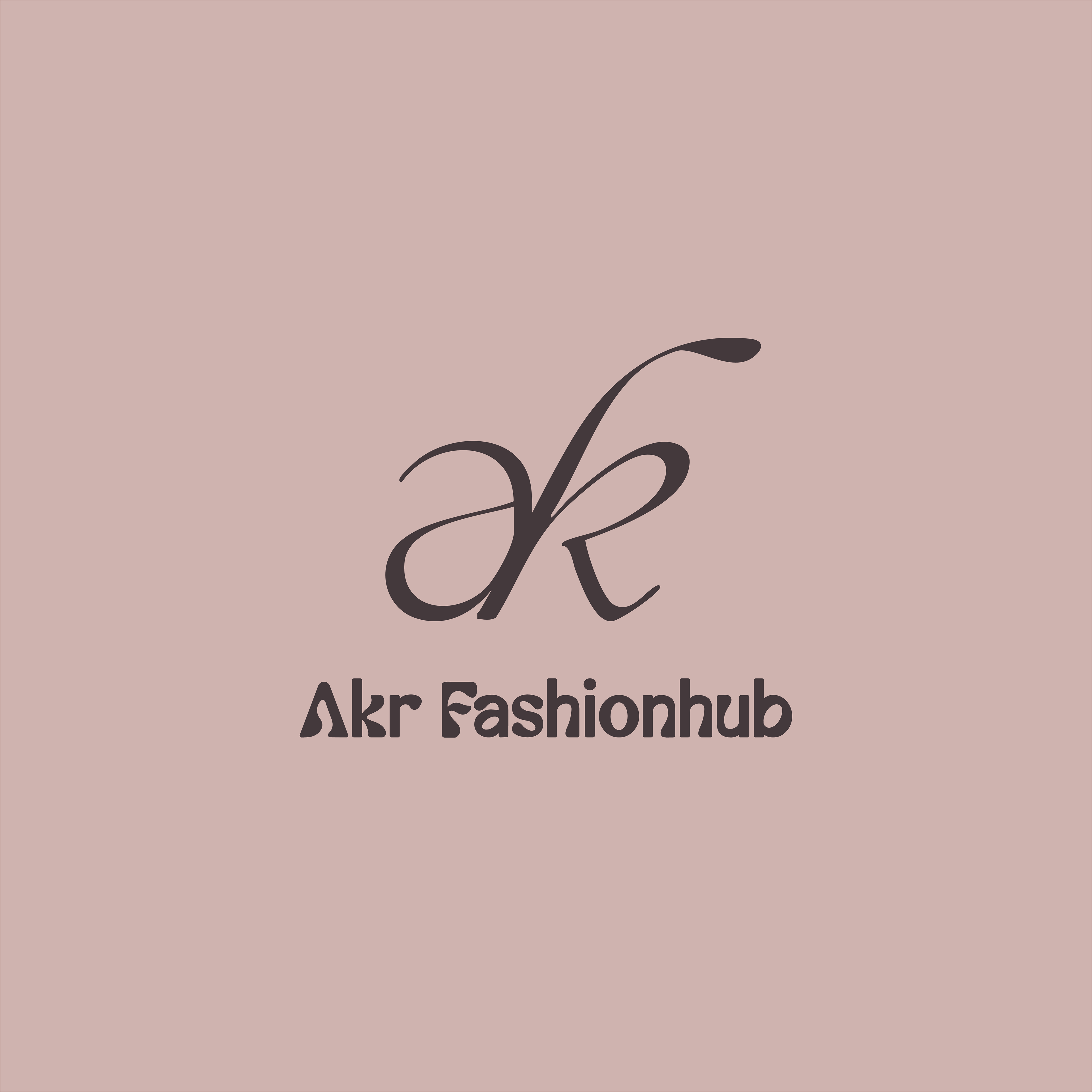
logo Design - akr Fashionhub
The Akr Fashionhub logo weaves the lowercase a, k, and r into one fluid monogram, echoing the way soft fabric drapes and overlaps. Each stroke is intentionally rounded to keep the mark friendly and approachable, while the continuous flow hints at the seamless craftsmanship the brand promises its clients.
Set beneath the icon, the wordmark uses a clean, boutique-style typeface that balances the playful curves above with crisp readability below. Together, they form a versatile emblem that feels just as at home embroidered on a blouse label as it does printed on luxe packaging or flashing across a social-media profile picture.
Color-wise, the logo is designed to sit comfortably on both light and dark palettes, making it easy to pair with seasonal lookbooks, promotional cards, and store signage. Overall, this monogram captures Akr Fashionhub’s core identity: modern elegance rooted in traditional tailoring, ready to elevate every piece it touches.
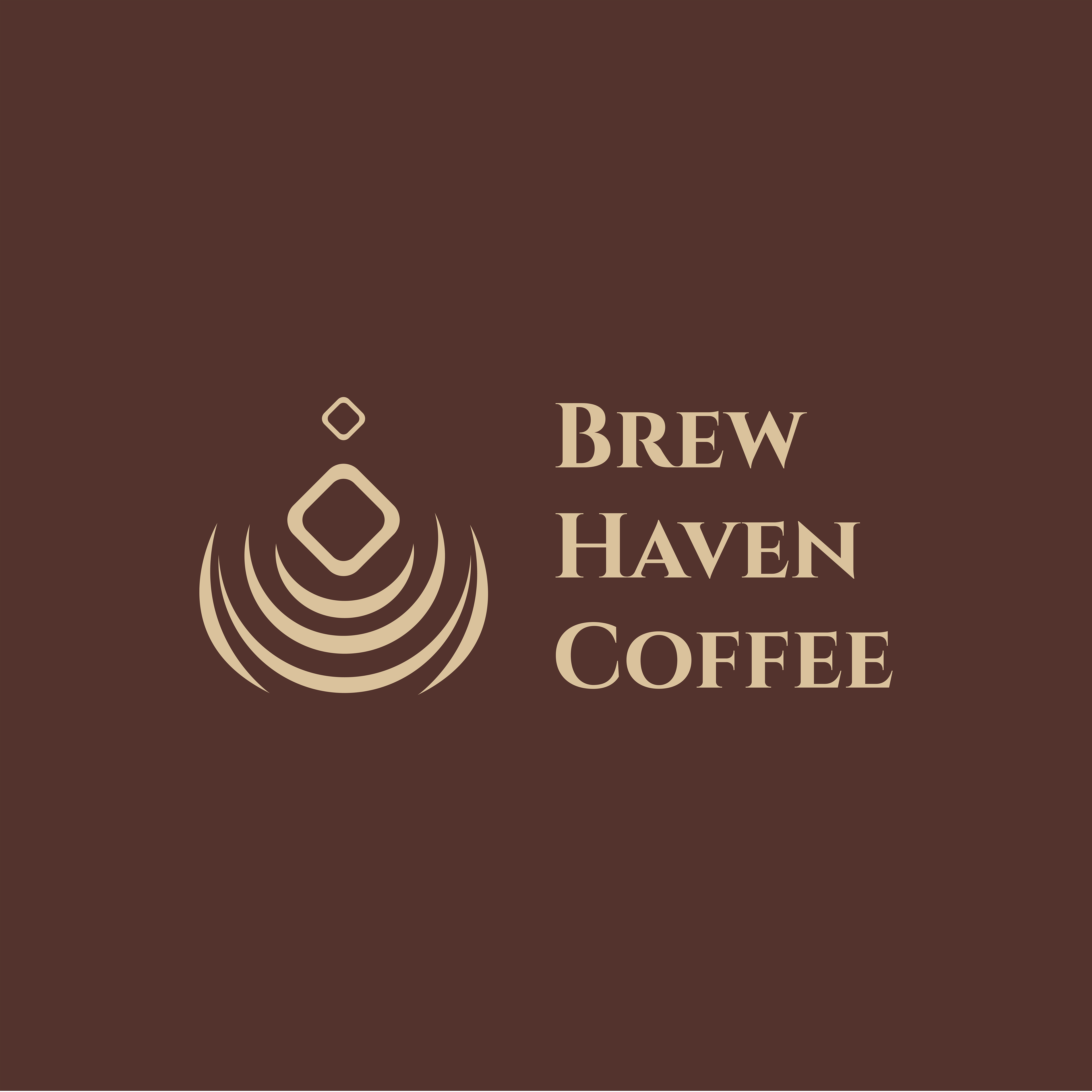
Logo Design – Brew Haven Coffee
The logo for Brew Haven Coffee was designed to feel both warm and sophisticated, capturing the essence of a cozy, welcoming coffee spot. The abstract emblem combines layered curves that mimic both rising steam and ripples in a coffee cup a subtle nod to comfort and calm. At the center, diamond forms create a stylized droplet, symbolizing the brewing process.
The serif wordmark reinforces the café's identity as a refined yet relaxing space, using strong, classical typography to balance the fluid shapes of the icon. A rich coffee brown background paired with a soft beige tone enhances the feeling of warmth, richness, and handcrafted flavor.
Whether used on signage, cups, or digital branding, the logo brings a sense of calm retreat — a true haven for coffee lovers.